Essential cookies required: We use reCAPTCHA cookies to protect our forms from abuse and prevent automated attacks.Without these cookies, form submission will be disabled for security reasons.Learn more in our Privacy Policy
Shopify Web Components
StoreScore provides three customizable web components that can be easily integrated into your Shopify store theme. Each component offers various configuration options to match your store's design and branding.
StoreScore Component
The main StoreScore component displays your store's performance rating with customizable styling and layout options.

Configuration Options
Size Options
- Small (sm): Compact display for tight spaces
- Medium (md): Standard size for most use cases
- Large (lg): Prominent display for emphasis
Display Type
- Checks: 5-star rating with checkmarks (1-5 scale)
- Percentage: Score displayed as percentage (0-100%)
Label Type
- Text: "StoreScore" text branding
- Graphic: StoreScore logo image
- Star: Star icon branding
Status Display
- Full Status: Shows complete rating text
- Score Only: Shows only the numerical score
- None: Hides rating text completely
Visual Options
- Dark Mode: Toggle for dark theme compatibility
- Show Border: Display container border
- Transparent Mode: Enable transparent background
- Transparency Level: Control opacity (0-1 range)
Layout & SEO
- Display Mode: Full width (section) or inline (flexible)
- Enable SEO Microdata: Structured data for search engines
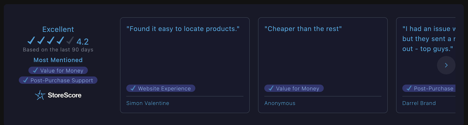
Testimonials Component
The testimonials component displays customer reviews and feedback in a carousel format, alongside your store score.
Configuration Options
Size Options
- Small (sm): Compact testimonials display
- Medium (md): Standard testimonials size
- Large (lg): Prominent testimonials display
Display Type
- Checks: 5-star rating with checkmarks
- Percentage: Score displayed as percentage
Label Type
- Text: "StoreScore" text branding
- Graphic: StoreScore logo image
- Star: Star icon branding
Status Display
- Full Status: Shows complete rating text
- Score Only: Shows only the numerical score
- None: Hides rating text completely
Visual Options
- Dark Mode: Toggle for dark theme compatibility
- Show Border: Display container border
- Transparent Mode: Enable transparent background
- Transparency Level: Control opacity (0-1 range)
- Card Borders: Show borders on individual review cards
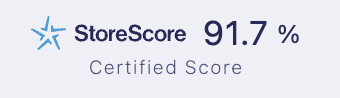
Badge Component
The badge component provides a compact, inline display of your store score with customizable taglines and alignment options.
Configuration Options
Display Type
- Checks (1-5): 5-star rating scale
- Percentage (%): Score as percentage
Label Type
- Text: "StoreScore" text branding
- Graphic: StoreScore logo image
- Star: Star icon branding
Visual Options
- Dark Mode: Toggle for dark theme compatibility
Content Options
- Tagline: "Buy with confidence" or "Certified Score"
- Text Alignment: Left, center, or right alignment
Installation
These web components are automatically available in your Shopify theme after installing StoreScore. You can add them through the theme customizer or by editing your theme files directly.
View Installation Instructions →